Exercise 5.7: Prepare your artist’s statement

Spend an hour or so looking at photographers’ artists’ statements. Some will be on their own websites (although it’s surprising how few practitioners do this), but you’ll find most information from the websites of the galleries that represent them. Collect a selection that interest you, noting the tone that’s used and how the practitioner’s inspiration and their particular use of techniques and materials are described. 

Using this document write an artist’s statement to accompany your self-directed project – this is not the same document as your evaluation which you should also submit as part of Assignment 5.


Artists statement

As individuals, we are constantly evolving – absorbing new information and expanding our horizons – we are products of our environment; William Clement Stone said “be careful the environment you choose for it will shape you; be careful the friends you choose for you will become like them.”

I am currently being shaped, by the OCA, into a photographer and this portfolio is a self-directed project that goes a fifth of the way to making up my marks for the Landscape module.

This project is part celebration (my father’s 80th birthday) and part investigation into the common activities that make us individuals. 80 years plots some of the milestones in my father’s life, some are happy and some are less so, but all of them are important because together they make him unique.

My initial intention was to create a simple pairing of new and archive images of the milestone-buildings, but looking through old family albums presented the opportunity to create a completely different blending. I decided to amalgamate two bodies of work, a contemporary set of images of the North East alongside my father’s personal archive. Combining these two was integral to developing an understanding the relationship between the individual and the environment.

The archive images were digitally scanned to enable the work to be presented on portfolio boards, but it was important to maintain the integrity of the images and no other manipulation occurred.

My main photographic influences are William Eggleston – his coloured works; Todd Hido’s – his approach to composition; and Trent Parke – his combination of image with memory.

Exercise 5.6: Context and meaning

Although you’re not expected to produce any kind of installation or exhibition of your projects at Level 2 (HE5), there is certainly no reason why you shouldn’t be thinking about where you could present your work, and how the meaning of your photographs could be strengthened or expanded by their physical location. Think about whether there is a particular place where you could install your work for Assignment 5. Perhaps it’s the same place that you shot the project, or somewhere that contrasts it somehow.

Part 1 – Make a very rough sketch of how prints could be hung, their scale, and anything else that might be incorporated into an installation. 

Part 2 – Read John A Walker’s essay ‘Context as a Determinant of Photographic Meaning’, first published in 1980. The text is not devoted to site-specific work in particular; however, it addresses the themes encountered in Part Five. Summarise Walker’s key points and note down your personal reflections.

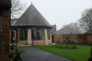
Part 1 – an installation, I have spoken to the church secretary to see if it would be possible to do a small exhibition in either the church hall or the chapter house (pictured below). It would be possible to book both, however, the church hall is larger and rectangular and has more available wall space, thus it’s probably easier to hang the images. DSCF2651


Part 2 – the key points highlighted in Walker’s essay ‘Context as a Determinant of Photographic Meaning’

  1. Does true individualism actually exist? No, because if it did there would never be consensus. “If an image had so many meanings, did this not render it meaningless?” Similar people – cultures, religions, age groups, etc – have similar views and opinions hence the ability for a film to smash box office records or a video clip to go viral. Nonetheless, limited individually does exist and of course there are individuals in every culture that (for whatever reason) deliberately buck convention – the exceptions that prove the rule. The challenge to true individualism is the fact the an individual will change their opinion on a subject depending upon their mood and the forum in which they are asked their opinion (peer pressure).
  2. Walker introduces ambiguity and complexity as a possible reason for variations of interpretation (individualism). I believe ambiguity leads to discussion, rather than interpretation, and thus more normally a consensus of opinion or no forming of any opinion; whereas complexity leads to a greater variety of interpretation because of the individual focusing on what is more personally relevant.
  3. Walker discusses ‘knowledge and experience of’ playing a part in understanding – the physicality of the denotation must limit the amount of variation that can be read into any particular image.
  4. “We cannot directly share the mental experiences of others” – so to the migration of the control of the image from the intention of the ‘author’ (the photographer) to the response of the ‘reader’ (the viewer).
  5. How impactful is change of setting on interpretation by the individual? A much discussed, perhaps over discussed subject, however, what about not just a change of context but also a change of social setting?
  6. Accepting that framing of an images enables a separation of the image from its contextual environment; is it significant enough to enable true segregation from its environment and the individuals environment? I don’t doubt this was a valid question back in 1980 and even 1997; but in 2016 I think its less about segregation and more about an images ability to meaningfully connect.
  7. What is meant by context? An especially important question in today’s multimedia environment… Walker discusses a third possible context, I suspect there are many more than three contexts today. Work (paintings, sculptures) used to be specifically commissioned for a place; works became smaller (or the world became smaller) and they were moved around and were re-contextualised; today works are created speculatively in the hope that at some point they will find (or earn) a suitable context.
  8. The same image is used across ‘arena’s’ thereby adding further complexity, contexts and meanings. Newspaper = documentary; gallery = art; if the images is presented in both arenas what is it?
  9. Photography because of its very nature – it is/was real at some point in time and place – is eternally and externally fixed.
  10. Does a photograph ever die? Or is it always waiting in the wings for the appropriate (or inappropriate) moment to be re-contextualised?

Exercise 5.5: Create a slideshow

Look at some of the audio-visual slideshows on the websites listed below and make some notes about particular works of interest, considering how they are edited, sequenced and how audio is used with images.

Whether or not you intend to present your photographs for Assignment 5 as an audio-visual piece, suppose for this exercise that you will. Familiarise yourself with any basic slideshow- or video-making software and compile an edit of your work, experimenting with transitions, text and music and/or sound effects. Save your work so that your tutor and/or an assessor can view this if necessary.

Write a brief evaluation of your work, commenting on how appropriate and effective you think this medium is for presenting your photographs.

I found Magnum in Motion in my first year with the OCA – at the time it was awe-inspiring, it still is but for different reasons. One of my current favorites is Trent Parke’s Minutes to Midnight. If you haven’t checked it out – you must.

For my first assignment I presented my assignment as a slideshow – falling from height – I stacked the images and animated the slideshow with the images speeding up the closer the got to the ground. It worked reasonably well, but did not fully deliver the affect I was looking for. My tutor suggested I use a moving image file rather than a slideshow because the images could be sequenced much faster (Lightroom slideshow @ 1 slide per second versus a Powerpoint slideshow @ 1 slide per 0.1 second versus a moving file @ 1 image per 100 milliseconds) – this was much more effective.

The journey for assignment 2 was a trip to Brussels by train, I made this journey again on the 17th December and for a short section of the journey placed my phone against the window and took a photograph every couple of seconds. For this exercise I selected 300 images changing every 150 milliseconds and made a moving file. 

Train journey GIF

Exercise 5.4: Online exhibitions

An online audio-visual piece doesn’t necessarily have to be the piece of art in itself, but may simply be part of the ‘presence’ of the work, put together to promote it, possibly to coincide with an exhibition or publication, or to help generate interest more speculatively. This post on the OCA blog by Sharon Boothroyd discusses a piece of work that is particularly relevant both to our discussions on contemporary landscape photography and the slideshow format. The sequence in question was designed to be the exhibition. 

LOOKING AT THE LAND 21st Century American Views

I found slideshow format of ‘Looking at the land’ difficult. The thumbnails on the site were a good size and enabled the view to scan the photographs without the need to expand. I found the ‘projection’ too slow, the photographs alone did not hold my interest. However, the information available – the biographies and the landscape stories – made the exhibition significantly longer but well worth seeing. It may be that the portfolio was too eclectic – lacking in natural flow – for this type of ‘exhibition’; but I’m not convinced that this format worked in this scenario. I agree with Dewald there was a definite topographical feel to a number of the images, but at the end I don’t feel empty or sad. The opening sequence – the photograph and the ‘treatment’ of the photograph did not fit at all with the rest of the exhibition! I’ve watched this a number of time now and I’m still none-the-wiser.

Considering this was an exhibition of ‘contemporary landscape photography‘ I found the artist responses to the last question Is the landscape photo tradition evolving in the 21st century? intriguing. There were some highbrow answers that added little to the debate, but on the whole the artists felt the landscape genre was evolving but couldn’t quite put their finger on ‘how’ it was evolving – technological advancements; individual approaches; sharing of information; changing environmental and social practices; changing relationships between humans and the natural world – but mostly that the genre was no longer being constrained by its original definition and as such could morph and develop in different ways to enable individuals to describe their own environment in their own way. I think Schenning summed it up beautifully.

Matthew Schenning  “We are all describing the world the best way we can.

Exercise 5.3: Print-on-demand mock-up

Whether or not you intend to produce a book to present your photographs for Assignment 5, suppose for this exercise that you will. During this exercise you’ll familiarise yourself with a print-on-demand application and experiment with a book design. 

If you don’t already have one, set up an account with a print-on-demand service, such as Blurb. 

Make some brief notes about how you found working with the software and briefly evaluate your rough book design, describing any particular design choices and noting any influences in terms of other books that inspired you. 

If you’re thinking about producing a book for your self-directed project, you may want to email the pdf or send a link to it to your tutor for their comments.


Barry Williams mock-up v2

This is a samples pdf from Blurb and as per the caption in bold at the bottom of each page – the photographs have not been optimised for printing, not only that, I have also zoomed some images to the point that the software is flagging a resolution risk.

This mock-up shows various different image page layouts, the software has a similar set of text page layout but I have not included any in the pdf. The software is simple and intuitive – drag and drop to select the layout required; load you images from your pc or storage device; zoom in/out to resize your images. Follow the exact same process for text, I find the text engine is lumpy, rather than just type in the text box there is a separate pop-up window to use – you do get used to it, but it’s a bit of a pain.

One down side to Blurb is the inability to create double spreads, most probably because of the binding process (the centerfold is quite deep) and there’s no option for lay-flat books. Nonetheless, Blurb is a simple and cost effective publishing process for personal project with requiring limited circulation. Using Blurb to layout your project and a great a feel of what it will look like as a book is ideal, however, if you require advice, flexibility or volume discounts I suggest contacting your local publisher.

Other self publishing sites, similar to Blurb are ‘MyPublisher‘ (does lay-flat books at a cost) and ‘Photobox‘.

An alternative publisher is MILK Books (Moleskine) – the software functionality is very similar to that of Blurb; the finish is far superior to Blurb but you pay a premium for this, more than 4x the cost. MILK Books are lovely, but realistically for presents and special occasions only.

Exercise 5.2: Print quotes

It’s not a requirement to submit prints for formal assessment, so you may choose to submit your work on the self-directed project in a different format, such as a book or a multi-media piece. However for the purposes of this exercise please imagine that you’re going to submit prints.

  1. Search the internet for different companies offering inkjet and C-type printing. Compile three quotes for getting your work professionally printed, with a variety of different options such as C-type or inkjet, for portfolio review. 
  2. Imagine you will order from one of these companies. Prepare one image file exactly as specified by the printers.
  3. Write a brief entry in your learning log, reflecting on whether or not you feel that an inkjet can be treated as a ‘photograph’.


Printing quotes:

SIMLAB

DS Colour Labs Genesis Imaging

C-type

Inkjet C-type Inkjet C-type

Inkjet

A5

25p £3.50 30p £6.99

A4

65p £5.60 65p £6.99 £25.00

A3 £1.10 £7.00 £1.15 £10.99 £30.00

£45.00


My submissions for assignments 2 and 3 were both formated for printing. I use SIMLAB and DS Colour Labs for c-type printing and have found both to be very good. As yet I have not done any professional inkjet printing.

I have an inkjet printer at home, the ink is massively expensive and in terms of cost I would suggest it is prohibitive to print at home if you are only going to use standard photo-papers. However, the limited experimenting I have done with the inkjet and different fine art papers have generated some incredible results. I printed a multi-layered image of gravestones on water-colour paper – the colours were very intense and the image looked 3D and jumped off the page.

I think printing is very much part of the photographic process and whilst it’s fine sharing your images on-line, there is something much more tangible (real) about looking at and holding a print. With the development of technology – printers, inks and papers – inkjet prints are now being guaranteed to 40 years, exactly the same as c-type prints. Inkjet printers are also capable of printing much larger images, effectively murals, banners and even wallpapers. I personally have no problem with the use of inkjet printers to print photographs and I’m also happy to accept that the printed article is a photograph. Is not sensible on the one hand to accept that a digital camera takes a photograph and then on the other hand reject a digital inkjet printer for not printing a photograph?


American Suburb X interviewed photographer Thomas Demand in October this year and discussed his latest project ‘The Dailies’ but interestingly they also talked about printing media – great common sense answers from Demand.

Exercise 5.1: Origins of the White Cube

Read Thomas McEvilley’s introduction to Inside the White Cube: The Ideology of the Gallery Space, which provides a good summary of O’Doherty’s suite of essays. Note down the key points and your own reflections in your learning log.

O’Doherty’s essays aim to describe three things:

  1. The influence of the gallery on the art object
  2. The influence of the gallery on the viewer
  3. How the context created by the gallery (curator?) consumes the object – leaving only the context.


Part 1 – the art object

The sterility of the gallery appears to have the ability to separate, or rather isolate, the art from its original context. By placing it inside a ‘sterile’ environment – the white cube – it is removed completely from its time and place; in this case time being the most critical of the elements. The principal reason being power over the situation; the situation being the art object, the viewer (specifically) and the general population (by maintaining the social hierarchy). If an object is rare, by default it becomes special, expensive and beautiful – regardless of reality, the object takes on an inferred status and this status ensures it maintains a safe distance from the mundane.

The white cube is likened to the pyramids and to the Paleolithic caves, both of which were perceived to be places of special (religious) significance to the ruling elite of the times. The most senior member of the societies were buried in these places, as close as possible to the Gods, to enable them to carry on their journeys into the next life. These places were considered to be ‘portals’ connecting heaven and earth, thus limiting the access to such places enabled the continuance of power within a select group of individuals. These ‘spaces’ remain unchanged because of their isolation and these ‘objects’ within them become mysterious, magical artifacts linking mortal man with eternity.

Back to today’s gallery space, by removing the art object from any context and placing it within the White Cube it ostensibly creates artistic posterity, of undying beauty, of the masterpiece. Similarly, the same specific type of limitations apply, ratification of the objects is made by an ‘elite’ group of people with a shared sensibility, effectively ignoring the rest of the population.


Part 2 – the viewer

This section is about the ‘human self‘ which ironically is nothing about the human self, but rather the self that we become when we enter the White Cube. O’Doherty believes “we absence ourselves in favour of the Eye and the Spectator“, in other words our behaviour becomes that which is expected by the elite group that allowed us access to their ‘religious sanctuary’. We are diminutive and respectful; we accept/believe what we are told; we whisper and we worship regardless of our religious proclivities.


Part 3 – the context become the art

Unlike other gallery spaces, the white cubes are sterile spaces specifically created as exhibition spaces; because of their ‘clinical’ environment, they don’t bring history (past building use) to the exhibition – the art stands by itself. O’Doherty traces the development transition of the cube as a space, as part to the object, as the enabler of the artwork, as the artwork itself…

The white cube was a transitional device that attempted to bleach out the past and at the same time control the future by appealing to supposedly transcendental modes of presence and power.” The problem with this concept is that the white cube became this transcendental or metaphysical world (space), the cube was/is the unchanging abstraction, the pure aesthetic.

Plato held that the beginning was a blank where there appeared inexplicably a spot which stretched into a line, which flowed into a plane; which folded into a solid; which cast a shadow; which is what we see.” If we accept that mathematics is a different dimension – a pure, abstract dimension – completely separate from the human dimension (realm), then the white cube (a pure geometric shape) could be the blank face from which art evolves.


So…

The purpose of the cube is to separate art from time and context; to wrap it in a controlling and limited aesthetic managed by an elite group of individuals whose purpose is power and commercial gain. To ensure that the art, its critics and its supporters remain aloof and at a comfortable distance from the masses; and at the same time foster a culture that facilitates eternality for the object and those involved. Additionally, the inferred religious status of the environment is such that when access is granted to the great-unwashed, they (we) wander around feeling humbled and awed by the experience – regardless of whether it was genuinely humbling or awe-inspiring.

Questions…

  1. If the environment does not enable us to be ourselves or allow us to question/challenge sufficiently to understand what we are seeing, then how do we appreciate the art?
  2. Why do we continue to return to these places if they make us feel uncomfortable or inadequate?
  3. If the white cube is part of the art object, does that not mean we are also part of the art object and integral to other people’s perception/appreciation of that artwork?
  4. Does it not also follow that different people will have/gain different perceptions of the artwork because they visit on different days with different people?

Finally, ignoring my cynicism, today’s’ galleries (white or otherwise) need funding and whether we like it or not art is now a commodity. Art and the art world has always tended to be a closed shop; but I would suggest galleries and museums are more accessible than they have ever been and also exhibit a significantly more diverse range of portfolios. Whilst it’s easy to be critical of O’Doherty’s essays they are 30 years old and as McEvilley states in his introduction ‘the rate of change is increasing and articles written today (1986) will either have been forgotten or will have become classics.’ That said, it is conceivable that the white cube could be the blank face of artistic evolution.
Part Five: Resolution

Extract from the course notes:

During the fifth part of the course you’ll predominantly be working on your self-directed project, but alongside this you’ll look at the different contexts in which we encounter and consume landscape imagery, with a focus on contemporary fine art, conceptual and documentary practice.

You’ll examine different modes of presentation, including the photobook, audio-visual slideshows, as well as different types of gallery spaces.

Part Five will also begin to address how you’ll contextualise and present your work appropriately to an audience.

Exercise 4.5: Signifier – Signified

Find an advert from a magazine, newspaper or the internet, which has some clearly identifiable signs. What are the signifiers? What is signified?

Read Barthes’ essay to help clarify your understanding of these principles – the way in which meaning is constructed in an image is directly relevant to photographic practice.


Twisted TM


Signifier Signified
Twisted TM The title implies ’wrongness’

Something slightly different or not quite as expected

Requiring of more than a cursory glance

Wrapped around

Situation Parking adds further to the concept of twisted

Specifically – up on rocks, at an angle, wheel slightly turned, nothing too out of the ordinary; but at the same time not run-of-the-mill

Location Confined space, rather than open landscape, different from other off-roaders Cramped location: small enough to fit but big enough to do the job

Capable of delivering the results, no matter the situation

3 people More than just your 2-seater land rover

Not just a work horse – it has room for friends

Climbing Big on space to fit all the climbing gear

Capable of getting you to the closest point to maximise you fun time and minimise your burden

Both the people and the vehicle are climbers; they’re almost as flexible and agile as each other

Dependable, reliable and safe – will wait patiently for your return

Almost B&W Enabler for getting back to nature and appreciating the basics

Lean and fit

Gritty and dirty – but in a good way

Reduced saturation to stress form and function

Lighting Clean lines – strong and competent without the need for frills

Harsh to accentuate lines and texture to enhance edginess

Similar muscle definition picked out on the first climber (the only one wearing shorts)

Focused onto vehicle to show water, dirt and finger prints – and still looking good

The scene is very rugged and manly

Cliff face Vertical face (life) presents a real challenge, but with friends and technology nothing is impossible

Extreme is an opportunity not a problem

The vehicle is an integral part of the team – part of your family, a friend


Exercise 4.6: Proposal for the self-directed project

The project brief:

Whilst visiting the Brighton Photo Biennial I purchased a little book entitled “Sunderland and South Shields in the 1980’s” by George Plemper.

I was initially struck by the simplicity of the images in the book – all B&W without titles or captions; an eclectic collection of urban views, land, sea, buildings, shops, people… regardless of their differences, together they capture the time and the feel of the place.

Plemper is well known for his portraits of the pupils when he was teaching in Thamesmead, London. His earlier photography, however, landscapes of the North East are less well known and a selection of these was published in this book by CRB (Cafe Royal Books) in 2014.

My interest in the book is twofold, first, I grew up in the North East in the 1980’s and Plemper’s photographs have captured the haunts of my childhood. It was a fun and interesting journey down memory lane with my family, especially because of the recent significant renovation of this specific area. Secondly, further investigation identified that a number of these photographs were taken by Plemper as a keep-sake for his father. Whilst we were identifying the locations, my father shared his memories of what used to be and where he and my mother and their friends used to go. The result of the conversation was the concept of using Plemper’s book as the framework for this project to create a portfolio of images that communicate “Sunderland and South Shields in the 2010’s“.


Influence and research:

George Plemper, Bill Wood, Lewis Baltz, Eugene Atget, Trent Parke. Other ‘authors’ of CRB books.


Project outcome:

With regards to presenting this portfolio, I would like to create a photo-book in a similar style and format as Plemper’s.

In addition, I would like to investigate the opportunity of printing the images and exhibiting them at the Seaburn Hotel or The Sea Hotel or on the new sea wall in South Shields.


Estimated budget:

Cost of book – circa £17 for a single book

Competition prints or print-on-board – circa £10 each, total £100


Updated with actual costs:

Book – £63.00

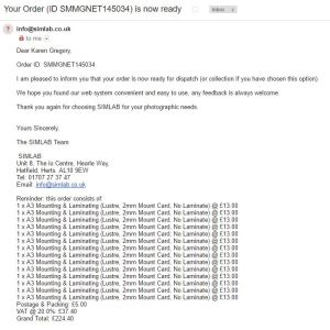
SIM book cost

14 prints on 2mm mount card – £224.40

SIM poster board cost